No.002
Bela Fool
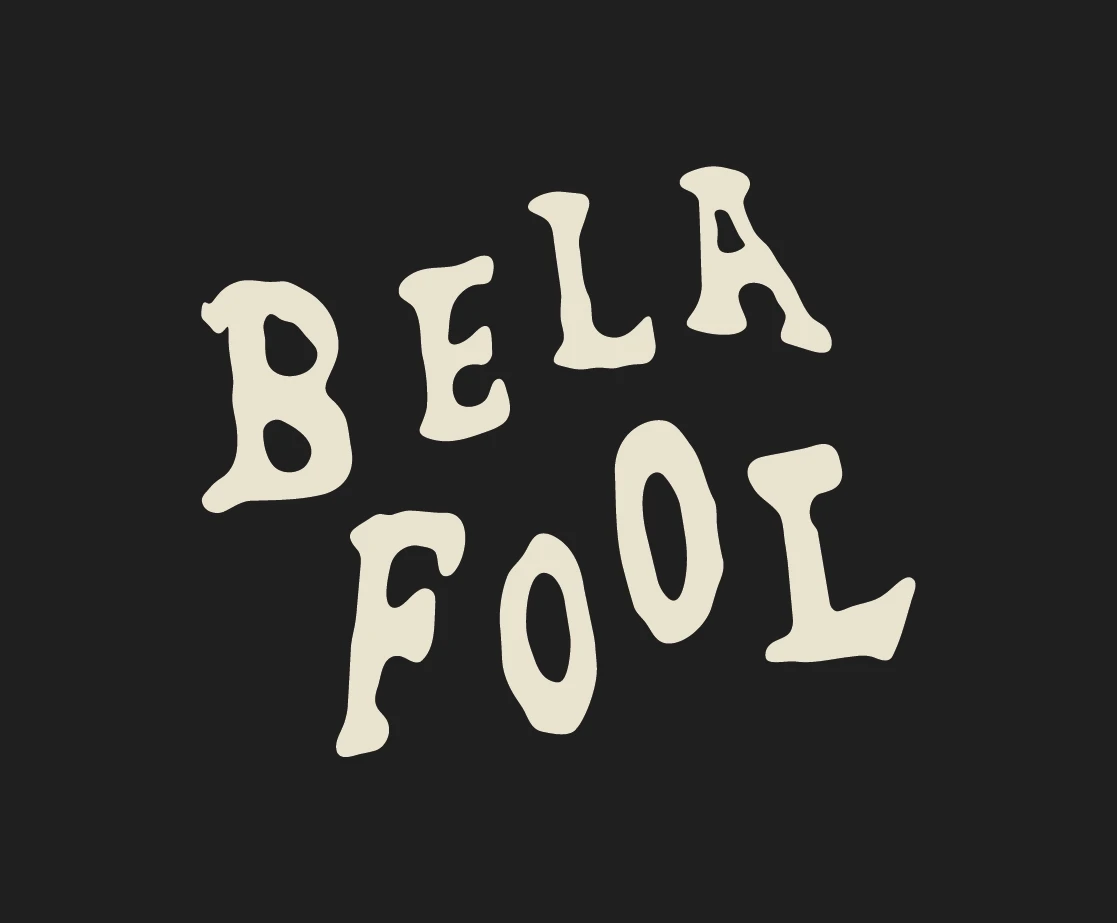

A visual identity system developed for Brighton-based rock band Bela Fool, built around their irreverent and unconventional character. The project includes a series of logo variations, colour palette and typographic direction, extended into a cohesive visual language across merchandise, posters and printed stage backdrops.
Client
Bela Fool
Year
2026
Discipline
Identity
Filed under
Identity
Overview
A world of fools
The identity of Bela Fool grows from the band’s existing lyrics and imagery, translating the characters, stories and recurring themes already present in their work into a cohesive visual universe. Drawing inspiration from ’90s British rock and urban and industrial atmospheres, the visual language combines irony, chaos and tension to reflect the band’s raw, unconventional and deeply human character.
At the heart of this universe is the figure of the minstrel — a provocative and ambiguous character who, much like the Fool in tarot, observes the world with sarcasm and lucidity. Developed from the imagery embedded in the band’s own work, the character becomes a recurring presence throughout the identity, connecting its different visual elements and applications.